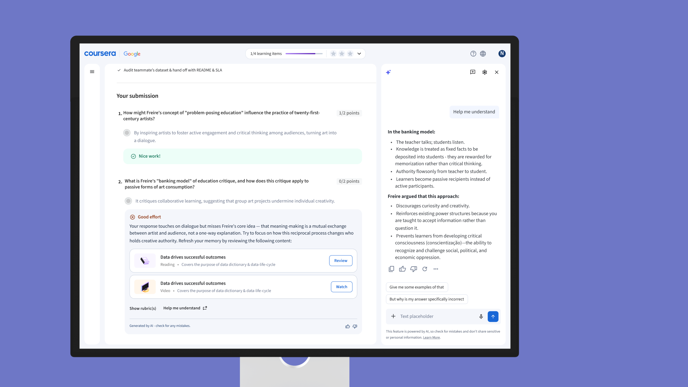
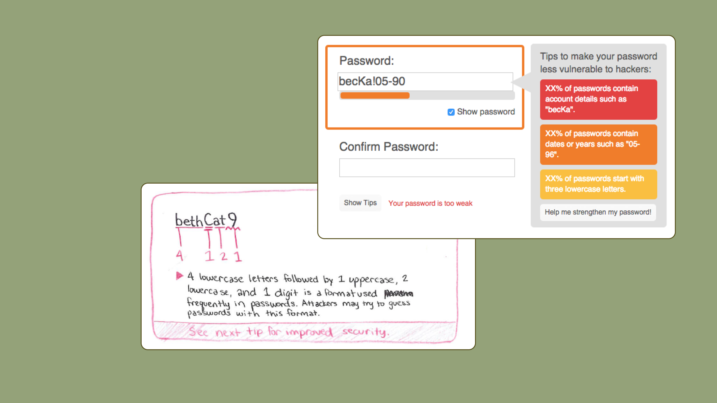
menu
  • My Work
  • Resume
  • About
  • Contact

Hi, I'm Felicia!

Head of User Experience at Orai in Philadelphia
  • All
  • Research & Design
  • Publications
  • Side Projects
  • editMy Work
  • library_booksResume
  • personAbout
  • mailContact
placeholder
Orai Mobile App

Orai Mobile App

AI-powered app that helps you become a more confident speaker

I joined Orai as the 3rd full-time employee and the only designer on the team. Since joining the team, I've iteratively redesigned the UI and overall user experience, established a fun brand and parrot mascot, and improved user retention and measurable learning. Orai is used by over 100,000 people around the world and in training for teams at various enterprises. To learn more, download the app on Android/iOS or visit orai.com. See below how Orai has evolved since I started:


A person feels a rudimentary graph made out of popsicle sticks. A person feels a rudimentary graph made out of popsicle sticks. A computer, keyboard, trackpad, and clipboard make up a testing station. A computer, keyboard, trackpad, and clipboard make up a testing station.
Research

At Orai, I have conducted extensive research with hundreds of people in the form of user interviews, usability testing, surveys, analytics tracking, and secondary research to build a robust understanding of people's behaviors around verbal communication, public speaking, and artificial intelligence. This knowledge base constantly shapes how I design and improve Orai features, but also helps me to understand how to tap into our users' motivation. Here are some interesting things we've learned:

1. Most people have anxiety when speaking in front of others, often due to a past traumatic experience
2. ESL speakers are eager to improve how fluent they sound, especially if they work in English
3. Job hunters and new employees have strong incentives to speak confidently
4. Objective numbers are hard to dispute, even though communication is a soft skill
5. People are skeptical if the AI seems to grade them too easily
6. It's very important that people understand both what they did poorly and how to do better next time

Design

The primary value proposition Orai offers is AI feedback on speech. The user records themselves speaking and we give feedback on their pace, filler words, energy, conciseness, confidence, and clarity. We've added and changed how these metrics work many times, so I've been constantly testing the effectiveness of the feedback itself as well as how I present that information to the user in our design. Through testing, I've found that point 6 from above is the most critical and I've created data visualizations, tooltips, and text feedback to give the user an overview of how well they performed and details to help them understand their personal opportunities to get better. We've also tracked their progress and compiled personalized trends in their profile.


A person feels a rudimentary graph made out of popsicle sticks. A person feels a rudimentary graph made out of popsicle sticks. A computer, keyboard, trackpad, and clipboard make up a testing station. A computer, keyboard, trackpad, and clipboard make up a testing station.

In addition to recording any speech, Orai uses bite-sized lessons to teach people what good speakers sound like and help them improve. When I started at Orai, only 20% of new users completed our first lesson (and 4% completed the third lesson). We brought in an instructional designer and I worked with them to make that lesson content interactive, fun, and bite-sized. Our improvements raised the ratio of new users completing lesson 1 to 70% and lesson 3 to 25%.

Much of my research and design has been focused on improving the app's stickiness, or how likely users are to come back to the app. We've introduced and some core gamification features like experience points and leaderboards. More specifically, we used to see people spending over 2 hours in Orai on their first day and never opening the app again. To address this, we introduced Orai courses to provide 5 minutes of daily practice, each including lessons, practice+evaluation sessions to reaffirm training, and a community-judged challenge. This structural change improved day 2 and 3 retention and grew into Orai Journey, which we've sold to enterprises as a 4- or 6-week training to help employees improve their speech. Through Orai Journey, we have measured over 10% improvement in overall speech for enterprise teams.

placeholder
U.S. Federal Government Agencies

U.S. Federal Government Agencies

As a User Experience Consultant at Deloitte Digital, I worked with clients in various U.S. federal agencies such as the Library of Congress and the Department of Health and Human Services. I cannot post any of that work publicly, but I'm happy to share samples if you send me an email!


placeholder
Sonify

Sonify

Project sponsored by Bloomberg, published in July 2019

Sonify is an interactive iOS app that uses pitch modification and screen reader technology to make stock price data accessible to people with visual impairments. My team conducted 4 months of intensive user research with people with disabilities before protoying and testing the novel interaction technique we introduce with Sonify. We published this work in July 2019 at the International Conference on Human Interaction and Emerging Technologies.


Research Insights

This project began as a general accessibility research problem. After doing an extensive literature review, conducting 11 interviews with people with disabilities, and synthesizing through contextual inquiry, we established the following insights:

1. I invent workarounds for even basic tasks
2. Updates derail my work
3. I am afraid of making mistakes other people might see
4. Even if accessibility tools exist, I can't easily find or learn to use them
5. I have to use multiple accessibility tools to accomplish a task
6. Tools that help me also hurt my work
7. It's impossible for me to get the "gist" of a page

Prototyping & Testing

We foucsed on point 7 and brainstormed ways to communicate the "gist" of a page, image, or graph to people with visual impairments. As Bloomberg Terminal users rely heavily on graphs of stock prices, we eventually discarded our other prototypes and continued iterating on ways to communicate the "gist" line chart data. In order to understand how charts and graphs are used by those in the finance field, we did interviews and "think-alouds" with about 20 participants who built and used graphs in the Terminal as well as people from a local blind community who explained how they used graphs and data.

After positive results to primitive tactile protoypes, we realized that combining a physical interaction with sound effects could provide context that traditional sonification solutions lacked. We began testing interactions based on the user pressing keys on a keyboard as well as dragging their finger across a trackpad (which we called "scrubbing").

A person feels a rudimentary graph made out of popsicle sticks. A computer, keyboard, trackpad, and clipboard make up a testing station. A person drags their finger across a trackpad.

We tested with 6 participants in the usability lab at Bloomberg. We sought to understand: Which interaction gives participants the most accurate interpretation of a graph? Which audio sounds are most pleasant? Which audio sounds most effectively communicate the graph?

We found that scrubbing through a graph was the most accurate interaction, but participants were confused about picking up their finger or wondering whether they were at the end of the graph or not. We realized that using a smartphone touch interface would solve that problem as it uses absolute rather than relative positioning. Participants also chose to get more exact information through text-to-speech output, so we decided to combine these ideas in the iOS touchscreen version of our prototype. Finally, we optimized the sounds based on participant accuracy and affinity.

Final Development

We tested the iOS prototype with 3 users with blindness and 1 person with a visual impairment and received positive feedback. We redesigned the interactions to be more compatible with VoiceOver (iOS screen reader) for improved discoverability and fluidity. We tested on both an iPad and an iPhone - we thought that a larger iPad screen might provide more precise data, but we found that blind participants preferred the iPhone screen because they could constantly track their finger position relative to the edges of the screen. We built and tested playing 2 different tones for 2 "lines" at once through varying sound quality and playing the two sounds into left and right stereo.

An iPhone displaying the Sonify app UI. A chart describing gestures to be used on the bottom half graph portion of the screen in Sonify. A chart describing VoiceOver gestures to be used on the top half of the screen in Sonify to switch datasets, change date range, and get other information.

In tests with the same users with visual impairments after those changes: (1) users were able to pick up the Voice-Over gestures well, (2) users were able identify when the 2 lines intersected or spiked, and (3) users were able to describe the gist of the dataset.

Mobile phone displaying Sonify app which helps people with visual impairments get the gist of a line graph.
Hexicon

Hexicon

Created by the company I co-founded, Scatterbrain Studio

Hexicon is a strategy word game for Android and iOS that I created with some friends originally as a side project. In June of 2019, we formed a company, Scatterbrain Studio, to support the game. Hexicon launched into open beta in November of 2019 and is free to play! You can get the game at www.hexiconapp.com if you'd like to try it out! In the game, players take turns spelling words on a board of hexagonal tiles to capture territory and score points; the first player to capture 16 tiles wins.


A person feels a rudimentary graph made out of popsicle sticks. A computer, keyboard, trackpad, and clipboard make up a testing station.

I designed the current Hexicon UI based on lots of playtesting and user feedback. I have also contributed to the game design of Hexicon. Designing a game as a side project is a lot of fun and a ton of hard work. We all had a lot of experience playing video and board games, but making one was new to us. We sought to create a visually clean and strategically challenging asynchronous word game. We began working on a word and territory control hybrid that eventually evolved into the current game. These are some key learnings from playtesting:

1. Hexagons provided more options than square grids
2. Our capture mechanic is satisfying, which is essential
3. Allowing each player 1 swap of adjacent tiles per turn adds a new level to gameplay
4. Prototyping fast and often helped us learn that our game concept was genuinely fun!
5. Simple rules are critical in this game
6. People love playing solo games on their phone, so our AI opponent is very popular


A person feels a rudimentary graph made out of popsicle sticks. A computer, keyboard, trackpad, and clipboard make up a testing station.

Hexicon is still a work in progress as we prepare for a full release of the game. If you're interested to learn more about our game design process, check out our blog on Medium.


placeholder
Data-Driven Password Meter

Data-Driven Password Meter

CUPS Research Lab, Best Paper Award at Computer Human Interaction (CHI) 2017

When I joined this project, my team had developed 20+ scoring metrics to rate the strength of passwords. After 6 months of research and testing, I developed a user flow that gives general feedback tips based on the typed password but also offers tailored suggestions to improve the password. Most importantly, the feedback aims to teach the user what makes a weak/strong password so they will make better passwords in the future. We tested this improved meter with 4,509 online participants and published the results in a paper at CHI 2017.

Research Process & Insights

I created 11 sketches of different solutions based on the scoring metrics and initial research. I conducted think-alouds with 6 people from different backgrounds and synthesized these insights:

1. Users reuse passwords and often make variations of "base" passwords to meet requirements on different sites.

2. Users make different strength passwords based on how much they value the importance of an account.

3. Users never click "Learn More."

4. Users find that too deep of a password breakdown can be "creepy," but they like custom suggestions.

A person feels a rudimentary graph made out of popsicle sticks. A computer, keyboard, trackpad, and clipboard make up a testing station. A person drags their finger across a trackpad.

I iterated through 4 more prototypes of increasing fidelity (eventually I built a web-based prototype with Javascript) to find the right balance. The biggest challenge is that people want their passwords to be very strong and easy to memorize, but they avoid spending time and effort to improve their security. Because of this disonnance, I used progressive disclosure to provide guidance on two "levels" of help for the user, in addition to the standard strength meter.

First, the meter provides tips based on the user's password that do not give away any sensitive information to potential "shoulder surfers," but provide contextual tips based on what the user entered. If the user wants to make a stronger password after seeing this feedback, the "Help Me" button asks to display their password and then calls out specific parts of the password that are weak, explains why, and gives a suggestion of how to fix it. For example, the public/private text outputs might be something like this:

Password: Stargirl8#
Public Text: The placement of capital letters in your password is predictable.
Private Text: 32% of people also capitalize only the first letter. Try changing which letters are capitalized like "stArGIrl8#"

To validate the success of our improved meter, we ran a 4,509-participant online study. We found that the data-driven meter with detailed feedback led users to create passwords that are more secure and no less memorable than a meter with only a bar as a strength indicator.

placeholder
Orai Manager Dashboard

Orai Manager Dashboard

Orai Mobile App Companion for Enterprise Teams

As we've begun selling Orai to enterprise teams as a training tool, I interviewed managers from departments like Learning & Development, Sales, Engineering, and Customer Service. My aim was to understand what information and tools they need to track their employees' progress, deploy training, and give contextual feedback. We created the Orai Manager Dashboard based on our initial insights and usability testing in pilot programs with companies like HPE, Comcast, and Medallia.

A person feels a rudimentary graph made out of popsicle sticks. A computer, keyboard, trackpad, and clipboard make up a testing station.

Our testing revealed that managers need a high-level view to check the status of their team along with the ability to dive deep into high and low performers to understand who needs work and how to help them improve. Our team-level view hightlights learner engagement, course completion, and score improvement overall and for specific metrics. The leaderboard gives a snapshot of the high achievers and the struggling users who would benefit most from manager feedback.

The other key feature for teams is a review tool. Team members record their audio and/or video in the Orai app and managers can review the reults and offer feedback tiee to specific points in the transcript. This flow highlights the beauty of AI acting as an assistant to busy managers so they know the most valuable places to spend their limited time giving human feedback that an AI cannot achieve.

Pilot teams have achieved over 10% improvement overall through training in the Orai app augmented by the manager dashboard.

placeholder
Hardware / Electronics

Hardware / Electronics

Arduino Projects
Smart Mirror Arduino Display

When I realized how much I rely on checking my phone as I get ready in the morning, I decided to create a "smart" ambient display behind a mirror, so I could get the information I want without interrupting my routine. I built a foam-board frame for a piece of 2-way mirror acrylic that would let light through but also function as a mirror. Using an Arduino Uno, a 16x32 LED matrix, and a proximity/light sensor, I designed the mirror to detect light change from hand swipes to switch between different information displays. I used Python and an API to pull live weather updates from weather.com and pass data about weather, date/day, and time through the serial port to the Arduino.

2-Player Chase Game

Players control their dots with two potentiometers that control movement up/down and left/right. The player controlling the bigger dot wins if they catch the small dot and the player controlling the small dot wins if they avoids the bigger dot for 10 seconds. This game is the first project I did in Arduino and the small and monochromatic matrix provided a challenging design constraint for a 2-player game. So, the players' characters are differentiated only by 1 or 2 dots on the matrix, and they are able to move quickly across the screen for exciting gameplay.

placeholder
Animations

Animations

Non-UI Animations
Tom Haverford's Food Language

This is my first kinetic typography project. I incorporate principles of animation to give character to the words in the audio clip from Parks and Recreation Season 3, Episode 10.


Astronaut Boy's Triumph

During the Spring of my year as a Master's student in HCI, I took Intro to 3D Animation. I made this model, rig, and animation over the course of 6 weeks. I storyboarded and asked a friend to pick up an exercise ball like the boy picks up his helmet to help me with timing and blocking of the animation. This was my first time animating in 3D, and it was one of the most challenging and enjoyable class projects I've done.


placeholder
Illustrations

Illustrations

Fun non-UI illustration
Popup Book

As a wedding gift for my cousin and her soon-to-be-husband, I wanted to create a way to preserve and share their love story. I have experience making popup cards, so I wrote their story in a rhyming couplet poem and made this popup book. I created and laser cut illustrations for five 2-page spreads and various foldout flaps. Every page has at least one movable part - the husband kicks a soccer ball, the ring pops up out of its case, a car slides along a track. I also worked to incorporate non-paper materials like string for the soccer net and mesh for the bride's veil. I improvised book assembly by using 11"x17" cardstock to bind thin cardboard covers together.

Cover of popup book Paper popup ring Popup soccer player, who is the finacee Popup couch with family sitting on it


Playable Board Game Cake

Ticket to Ride is a popular board game in which players use trains to connect routes on various maps of the world. For a birthday gift, my cousin and I created a map of our home county in Pennsylvania on a cake. I designed cards for the custom route tickets, we made trains and a score track out of fondant, and used toothpicks to label all the destinations. We privately playtested on paper to try and balance the game as much as possible beforehand because we were only able to play one game on our edible map.

Cake version of Ticket to Ride board game Tickets of routes for Ticket to Ride board game